rYde redesign
redbus internship. case study. 2023.
rYde redesign
redbus internship. case study. 2023.
redesigning homepage and search results page of rYde
redesigning homepage and search results page of rYde
problem statement. this project is about redesigning the homepage and search results page of rYde, make it visually appealing, enhancing the functionality and the overall user experience.
problem statement. this project is about redesigning the homepage and search results page of rYde, make it visually appealing, enhancing the functionality and the overall user experience.
8 weeks
8 weeks
timeline
timeline
ideation and visual design
ideation and visual design
is all i did
is all i did
get the higlights
get the higlights
take a closer look at
take a closer look at
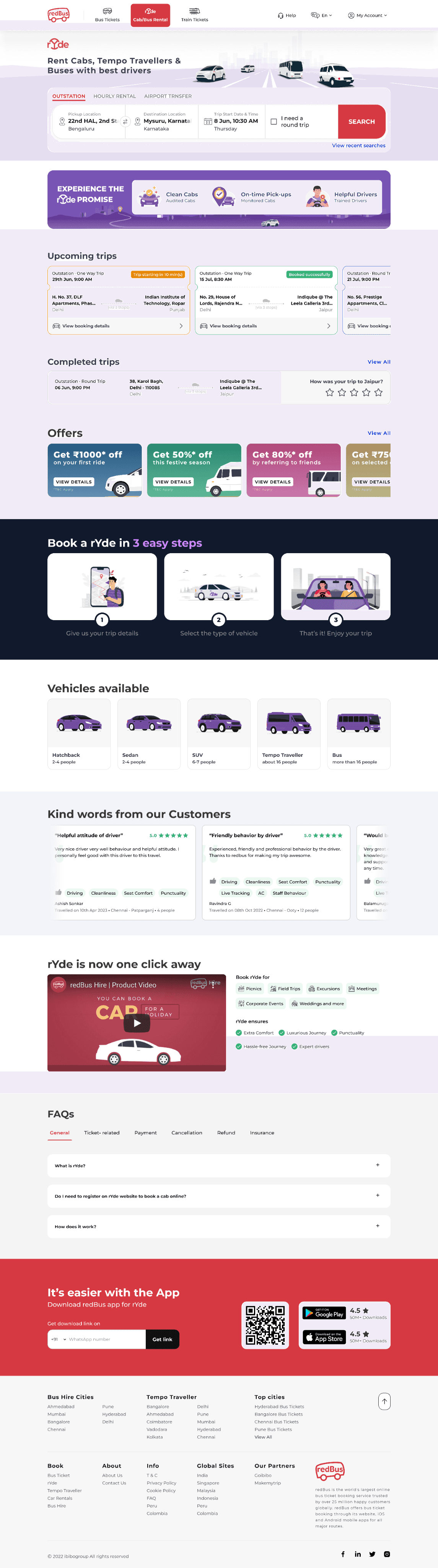
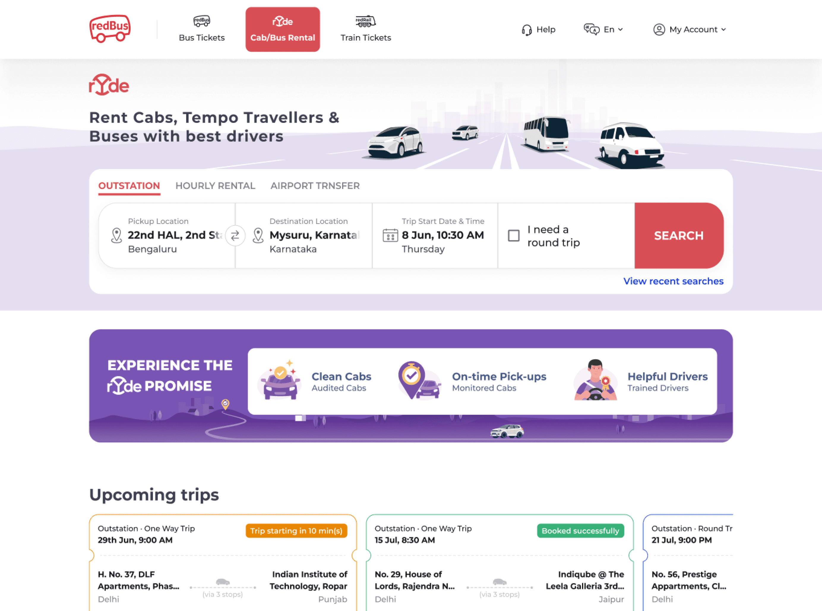
rYde homepage
rYde homepage
before
before
after
after
rYde search results page
rYde search results page
before
before
after
after
explore the full story
explore the full story
but hold on,
what rYde is?
but hold on, what rYde is?
rYde. rYde (by redBus) is one of India’s largest cab booking platform. it is one of the business verticals of redBus. it offers a platform to anyone who wants to book cab online for outstation trips, hourly rental trips and airport transfers. not only cabs, people can also hire tempo travelers and buses for any kind of trips from wedding occasions to corporate meetings to picnics and a lot more.
rYde. rYde (by redBus) is one of India’s largest cab booking platform. it is one of the business verticals of redBus. it offers a platform to anyone who wants to book cab online for outstation trips, hourly rental trips and airport transfers. not only cabs, people can also hire tempo travelers and buses for any kind of trips from wedding occasions to corporate meetings to picnics and a lot more.
it all started with
it all started with
as every other redesign project starts by first auditing what problems we have currently in the product.
as every other redesign project starts by first auditing what problems we have currently in the product.
i wanted to address
i wanted to address
issues like absence of grid system, inconsistency in components between rYde and redBus pages and lack of visual hierarchy in multiple sections. i’ll explain other problems at individual section of the website.
issues like absence of grid system, inconsistency in components between rYde and redBus pages and lack of visual hierarchy in multiple sections. i’ll explain other problems at individual section of the website.
i approached the project by
i approached the project by
exploring
exploring
the issues as to why redesign is required. for certain sections of the website, i also did a comparative study.
the issues as to why redesign is required. for certain sections of the website, i also did a comparative study.
ideating
ideating
and broke the problems into bits and tried to solve it using first principles.
and broke the problems into bits and tried to solve it using first principles.
creating
creating
high fidelity visual designs involving multiple use cases.
high fidelity visual designs involving multiple use cases.
so let’s start with
the homepage
so let’s start with
the homepage
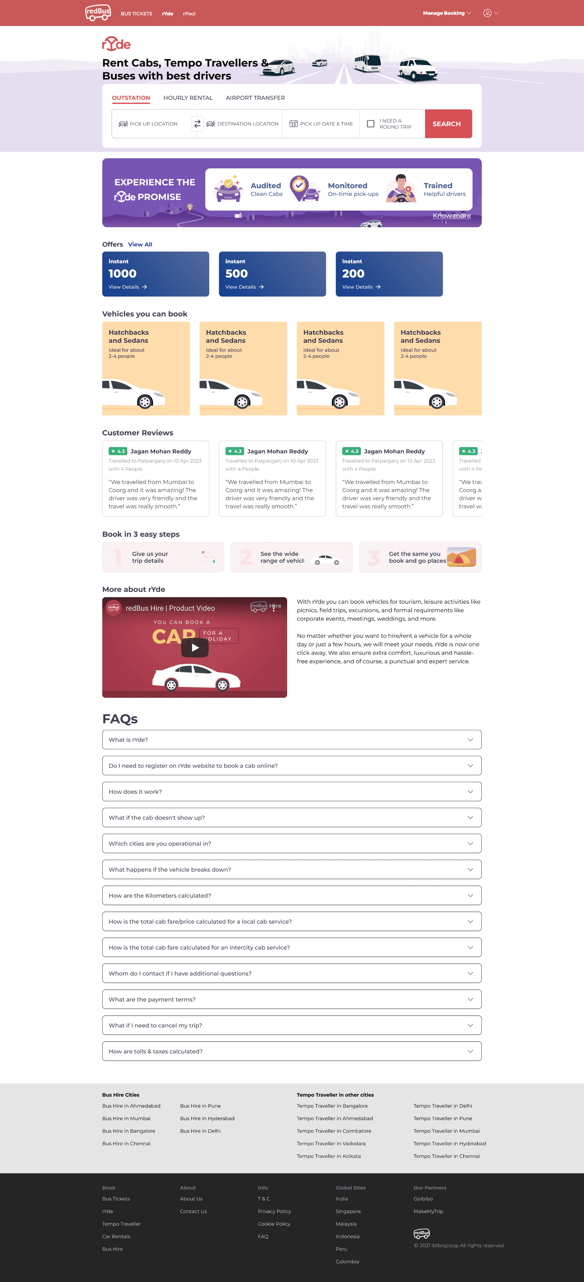
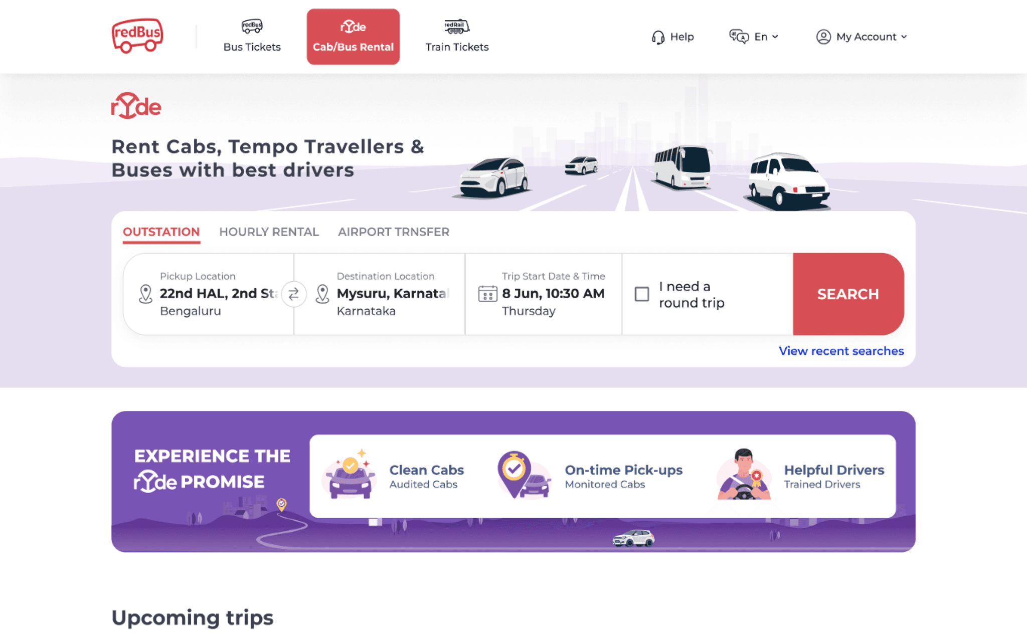
OLD
navbar, search widget & footer
navbar, search widget & footer
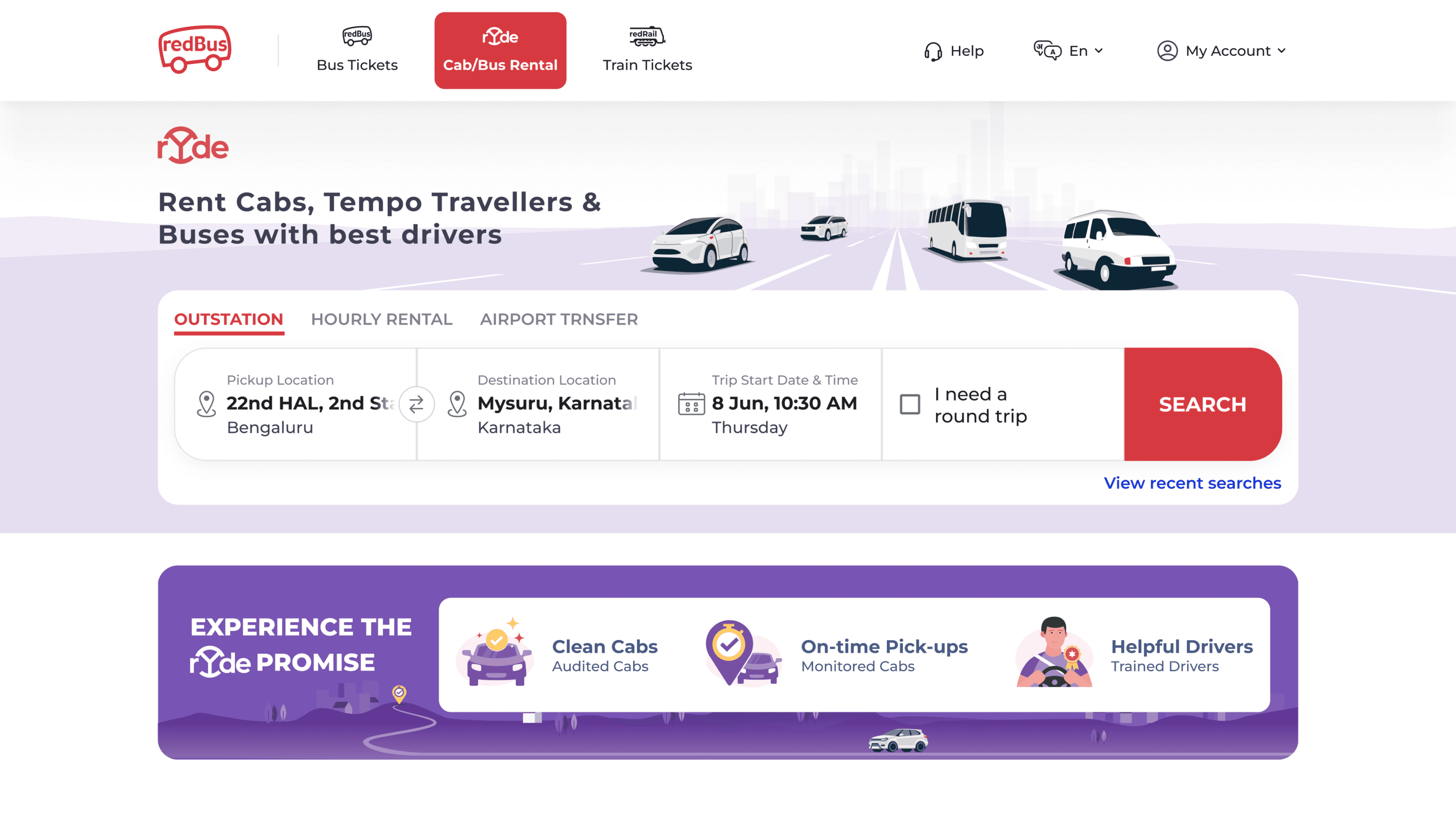
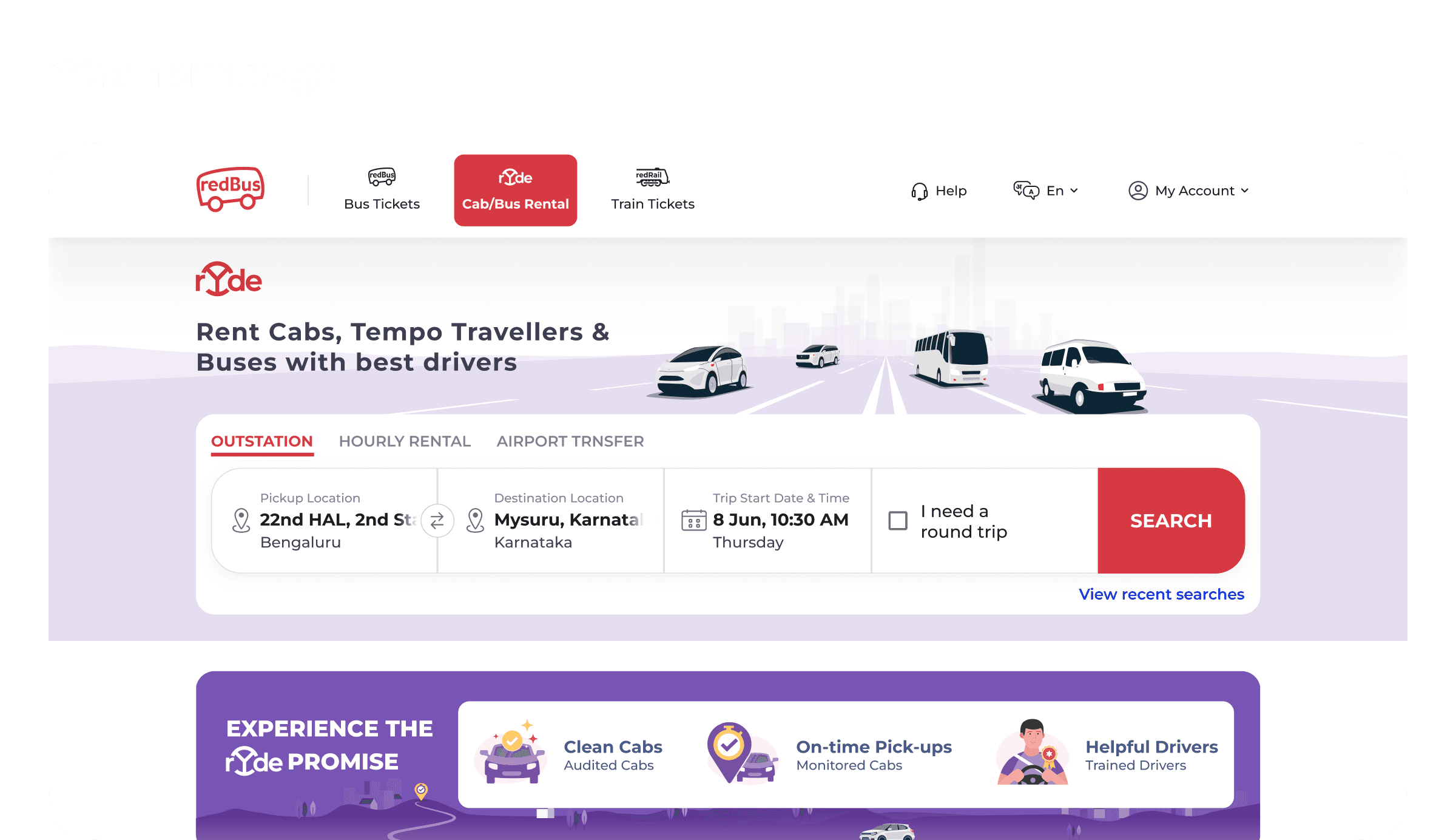
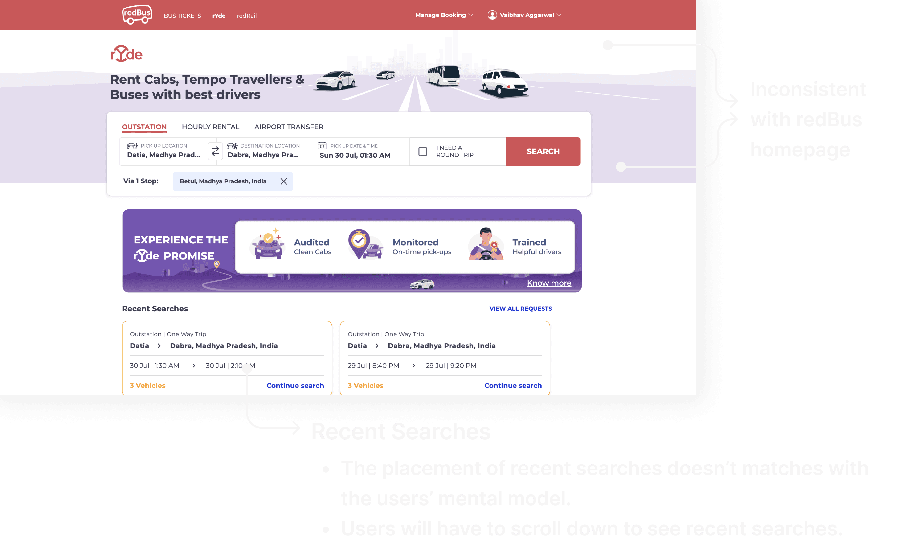
problem. the major problem why we wanted it to be redesigned is the inconsistency between rYde and redBus homepage. other problems with search widget include absence of “view recent searches” in the search widget.
problem. the major problem why we wanted it to be redesigned is the inconsistency between rYde and redBus homepage. other problems with search widget include absence of “view recent searches” in the search widget.
NEW
navbar, search widget & footer
navbar, search widget & footer
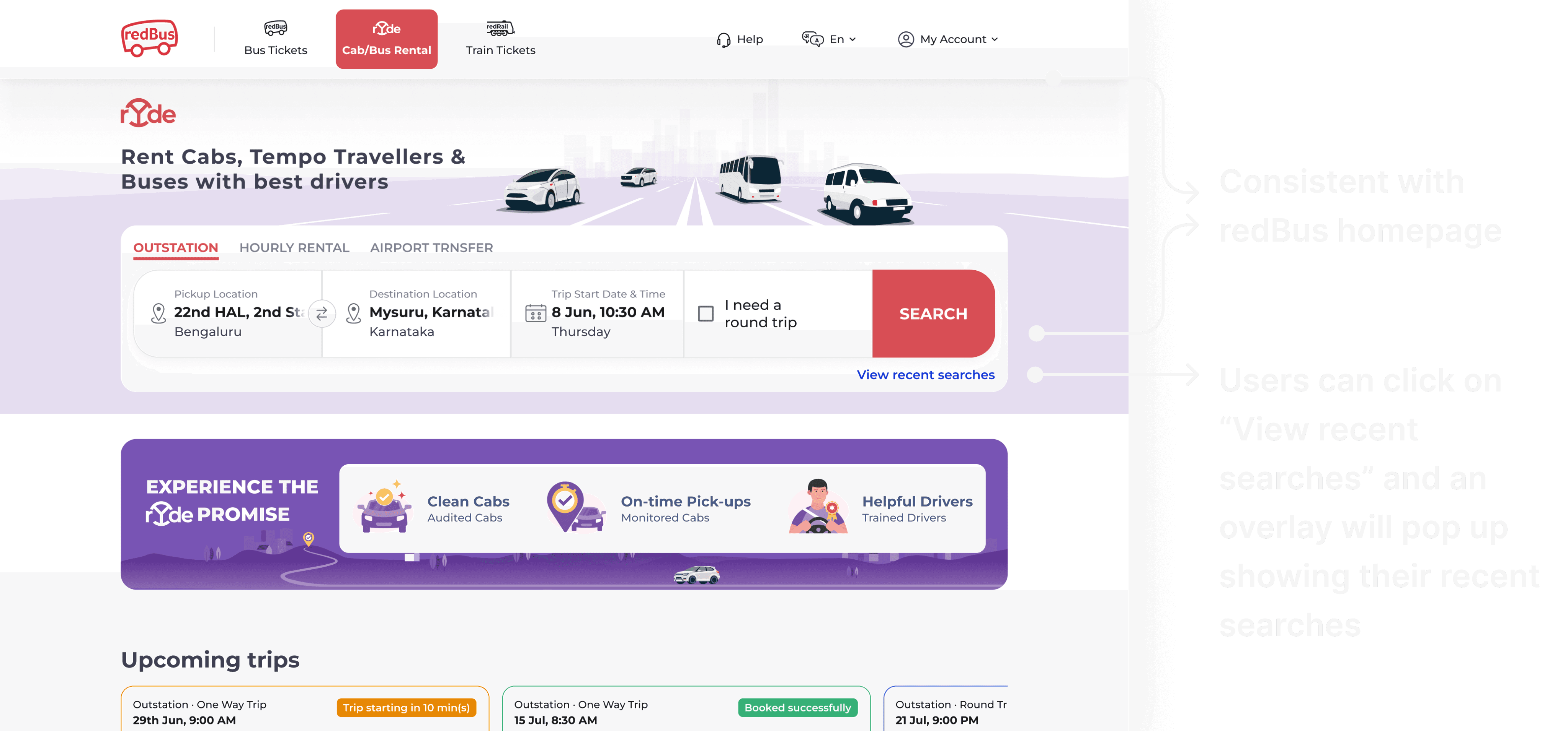
solution. before I joined, the redBus homepage was already designed and developed. so, it became easier for me to take the same search widget and tweak it to suit the use case for rYde. the same goes for navigation bar and footer.
solution. before I joined, the redBus homepage was already designed and developed. so, it became easier for me to take the same search widget and tweak it to suit the use case for rYde. the same goes for navigation bar and footer.
OLD
upcoming trips & completed trips
upcoming trips & completed trips
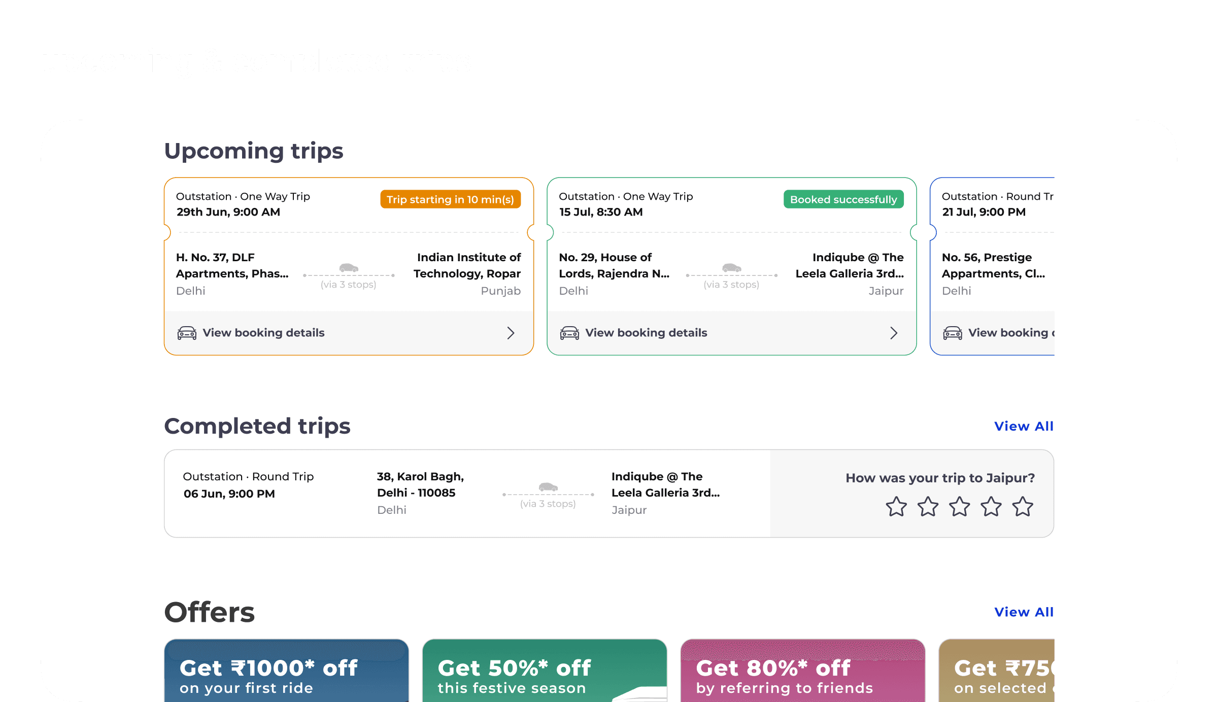
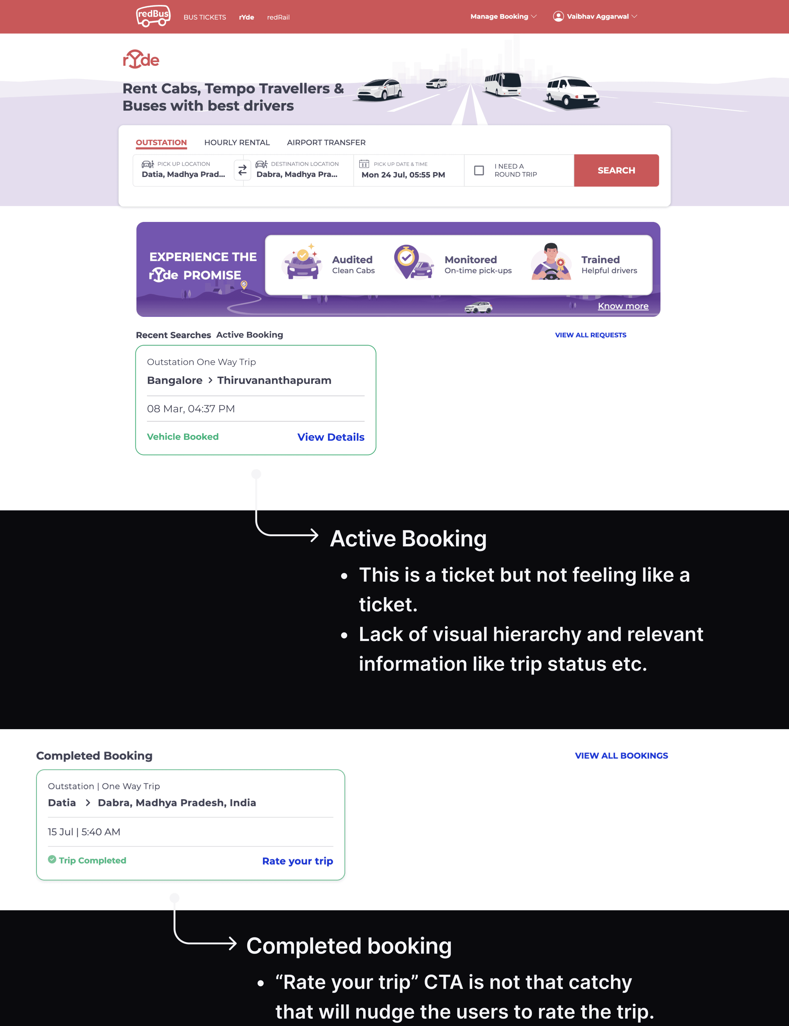
problem. earlier with a simple card-like design and with lack of visual hierarchy, upcoming trips were looking very boring and not giving a delight feeling to the users.
for completed trips, the “Rate your trip” CTA is not that catchy to nudge users to rate their trip.
problem. earlier with a simple card-like design and with lack of visual hierarchy, upcoming trips were looking very boring and not giving a delight feeling to the users.
for completed trips, the “Rate your trip” CTA is not that catchy to nudge users to rate their trip.
NEW
upcoming trips & completed trips
upcoming trips & completed trips
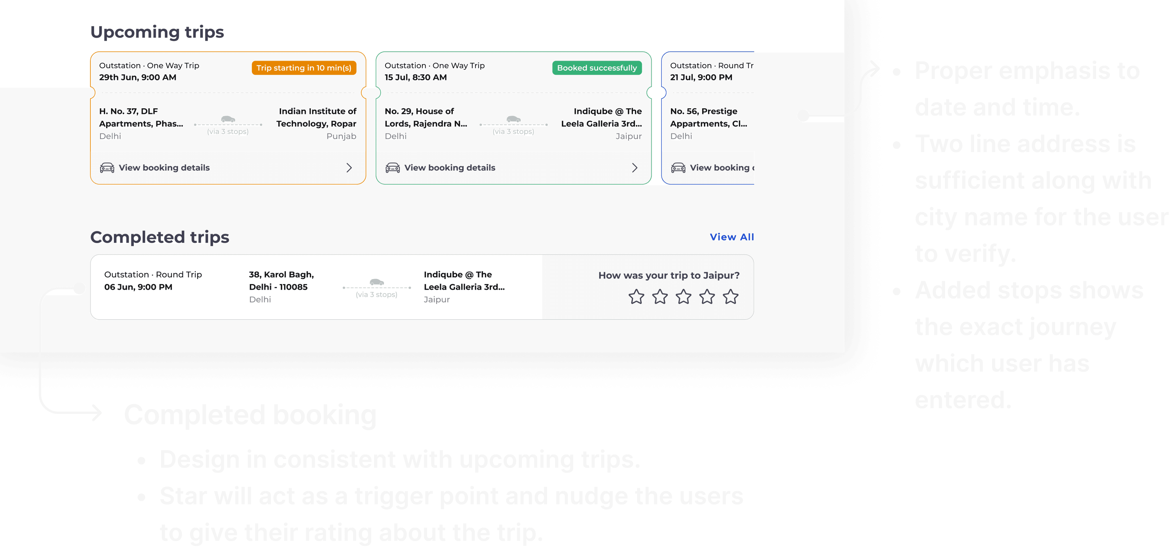
solution. by presenting a booking look like a ticket, we are giving a delightful experience to our users.
solution. by presenting a booking look like a ticket, we are giving a delightful experience to our users.
explore
explore
the iterations
the iterations
OLD
offer cards
offer cards
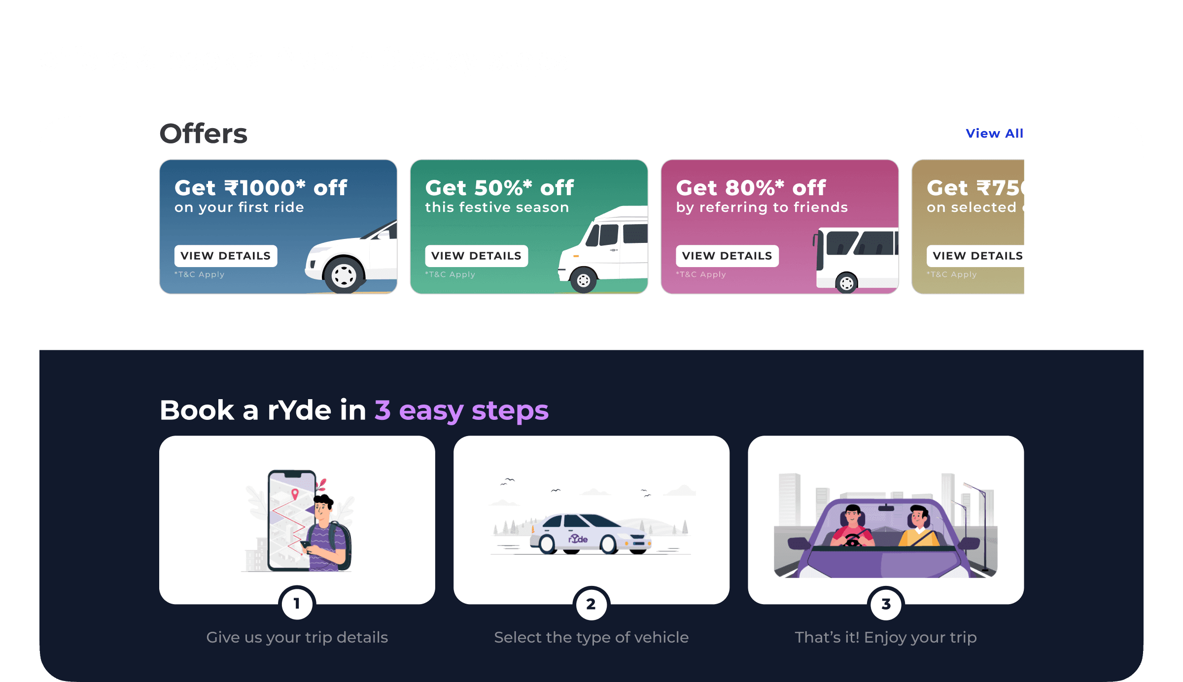
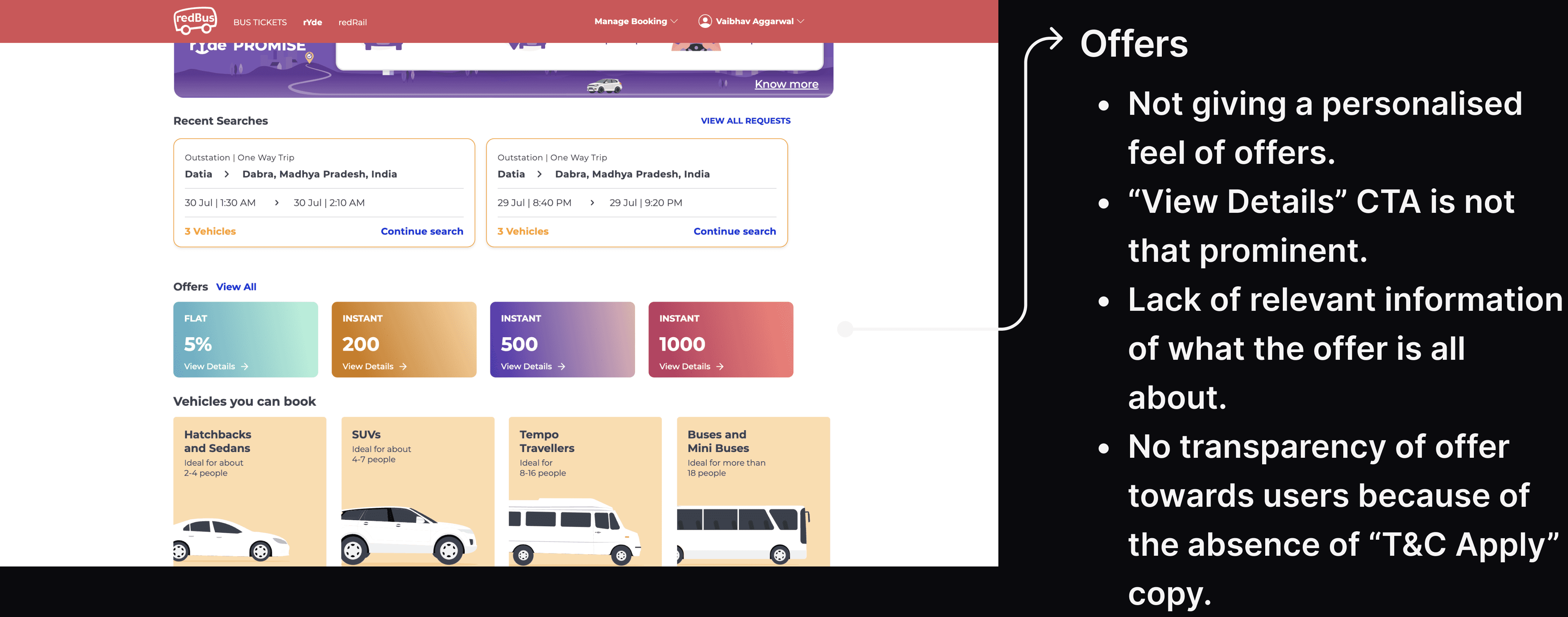
problem. earlier with a simple gradient and no visuals, the offers were not looking like offers. also, the copy we used was not self-explanatory. the CTA to view details was not that highlighted.
problem. earlier with a simple gradient and no visuals, the offers were not looking like offers. also, the copy we used was not self-explanatory. the CTA to view details was not that highlighted.
and who doesn't
love a good offer! so
and who doesn't
love a good offer! so
NEW
offer cards
offer cards
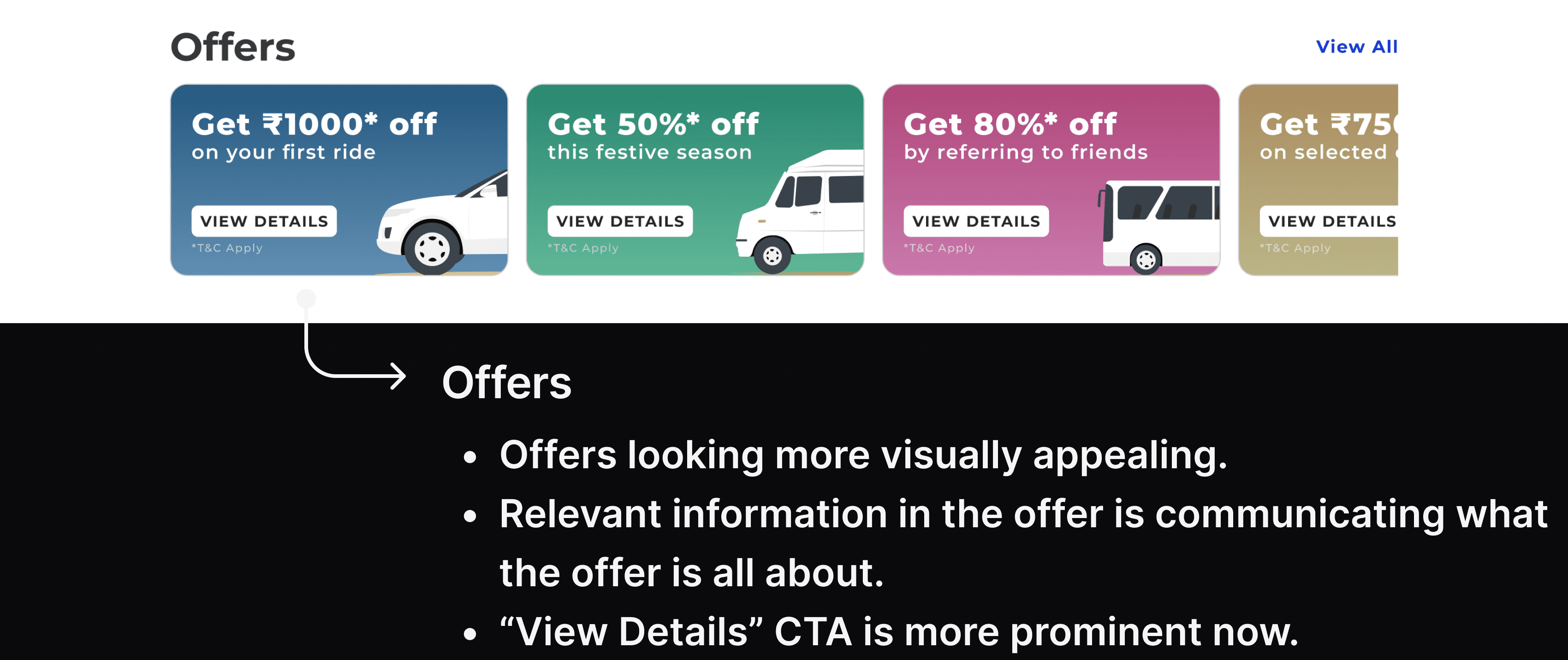
solution. by making offers more pronounced using soothing gradients, we are nudging the users to use them and not ignore them.
solution. by making offers more pronounced using soothing gradients, we are nudging the users to use them and not ignore them.
explore
explore
the iterations
the iterations
OLD
book in 3 easy steps
book in 3 easy steps
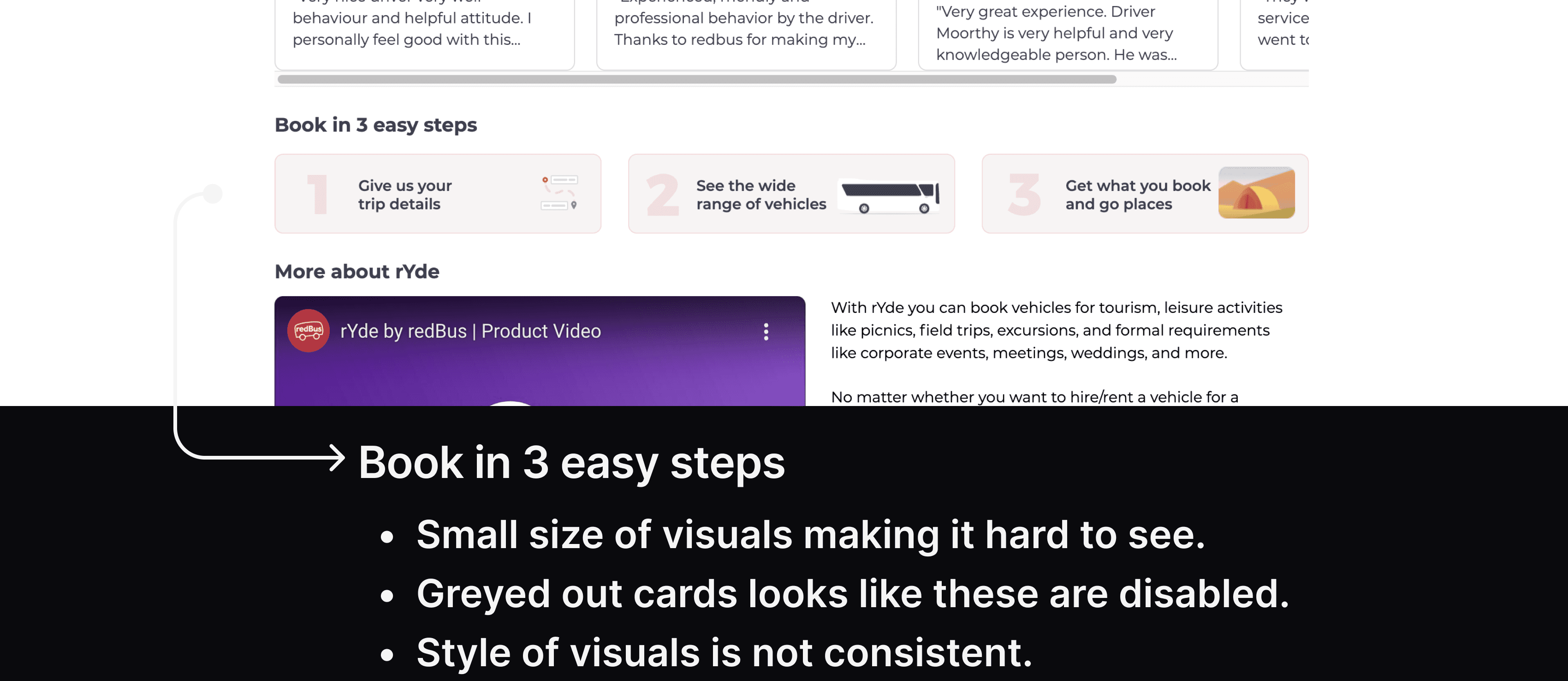
problem. earlier, it was shown like a boring 3-step process using cards and hence wasn’t emphasized that much. the visuals are quite small and it wasn’t giving a feeling as if we are telling a 3-step story.
problem. earlier, it was shown like a boring 3-step process using cards and hence wasn’t emphasized that much. the visuals are quite small and it wasn’t giving a feeling as if we are telling a 3-step story.
NEW
book in 3 easy steps
book in 3 easy steps
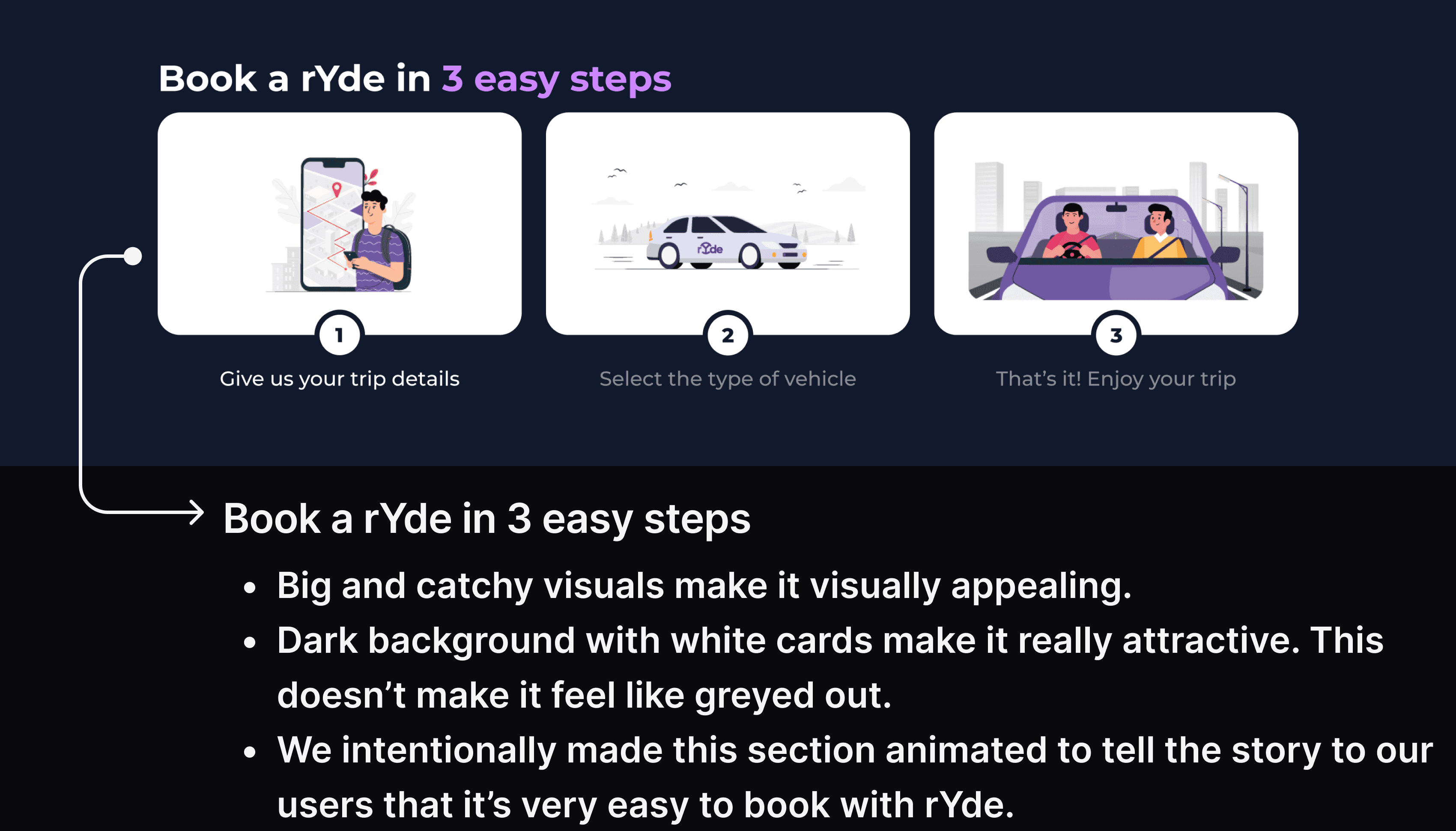
solution. by using a dark background and animated cards, my goal was to tell this 3-step process like an animated story.
solution. by using a dark background and animated cards, my goal was to tell this 3-step process like an animated story.
OLD
customer reviews
customer reviews
problem. this section was quite static which means people have to scroll through this section to read other reviews but who will scroll. i also did a comparative study for designing customer reviews.
problem. this section was quite static which means people have to scroll through this section to read other reviews but who will scroll. i also did a comparative study for designing customer reviews.
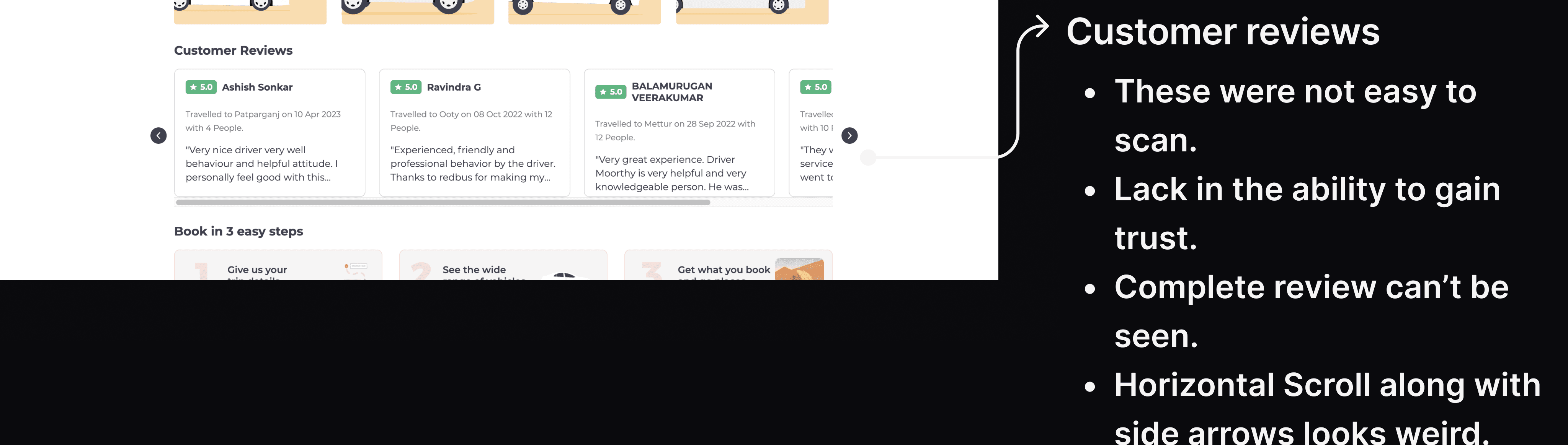
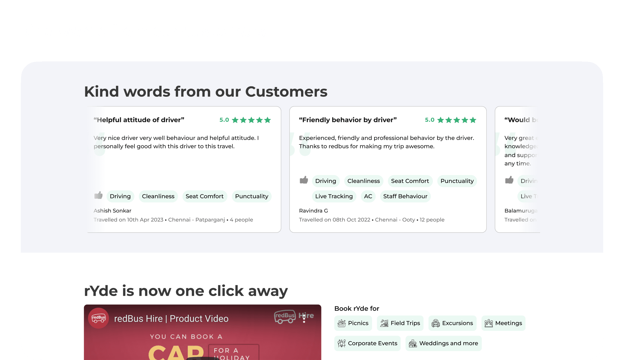
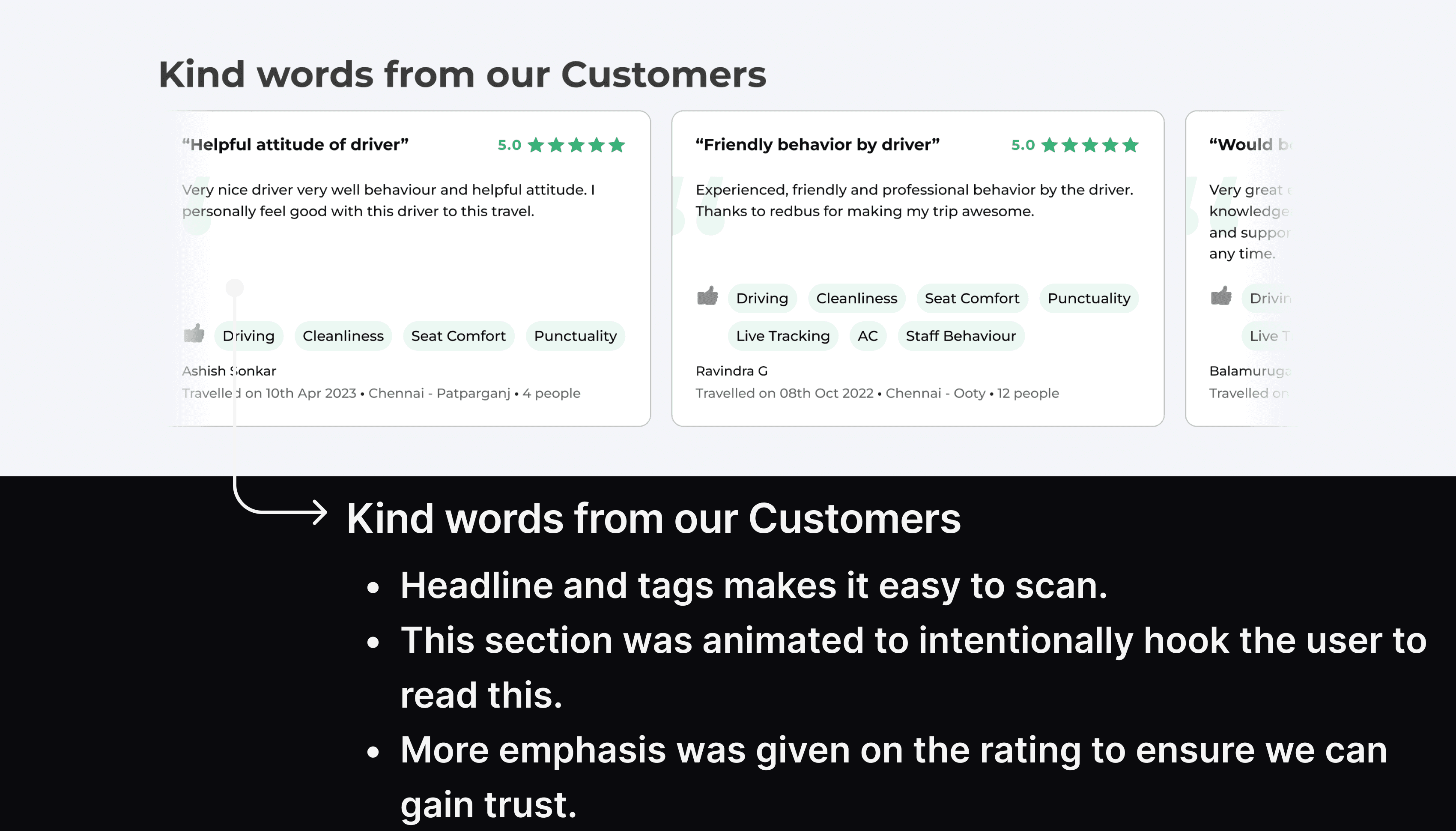
NEW
customer reviews
customer reviews
solution. using tags and headline, we made sure when people come to this section they don’t skip it and scan through the reviews easily and can book comfortably through rYde.
solution. using tags and headline, we made sure when people come to this section they don’t skip it and scan through the reviews easily and can book comfortably through rYde.
OLD
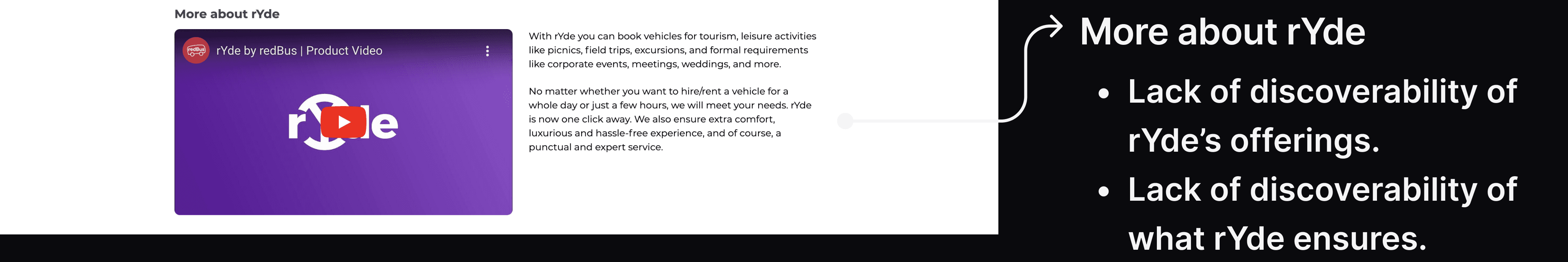
rYde’s offerings
rYde’s offerings
problem. rYde’s offerings were hidden in a long paragraph and who will read this long text to figure what our core offerings are. there was a clear lack of discoverability of our core offerings.
problem. rYde’s offerings were hidden in a long paragraph and who will read this long text to figure what our core offerings are. there was a clear lack of discoverability of our core offerings.
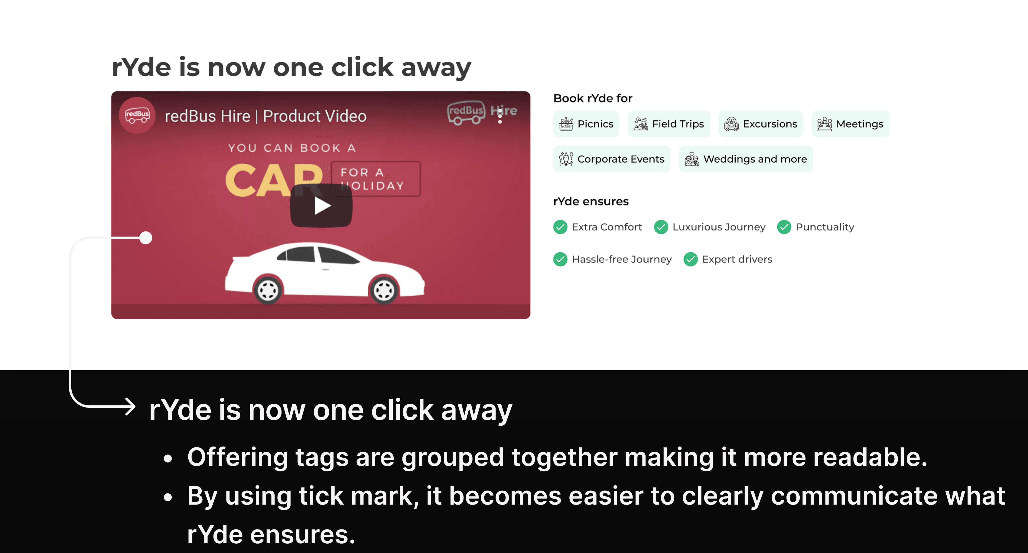
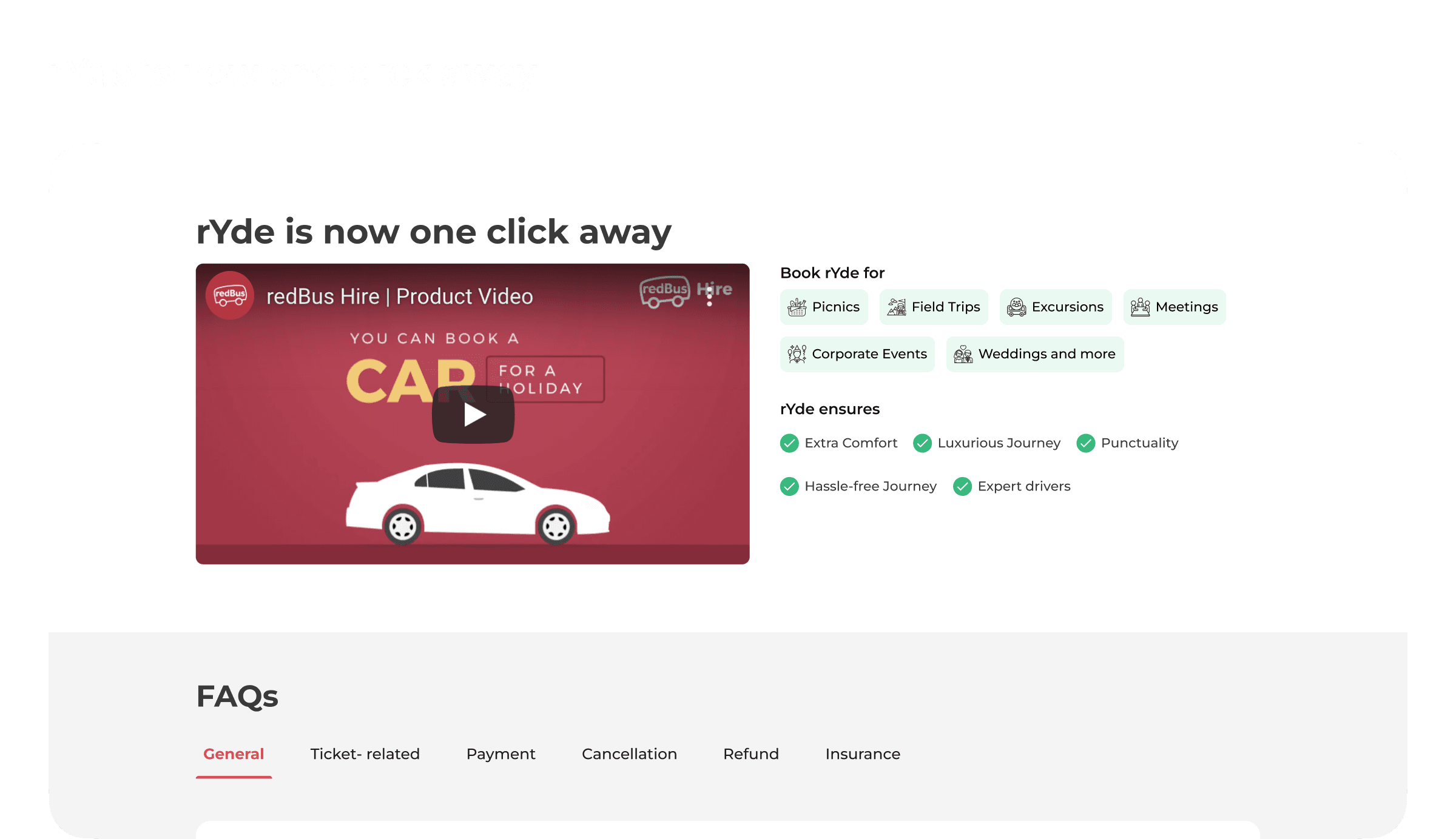
NEW
rYde’s offerings
rYde’s offerings
solution. by introducing tags, it will become easier for the people to scan through our core offerings and also what rYde ensures.
solution. by introducing tags, it will become easier for the people to scan through our core offerings and also what rYde ensures.
and now comes the
search results page
and now comes the
search results page
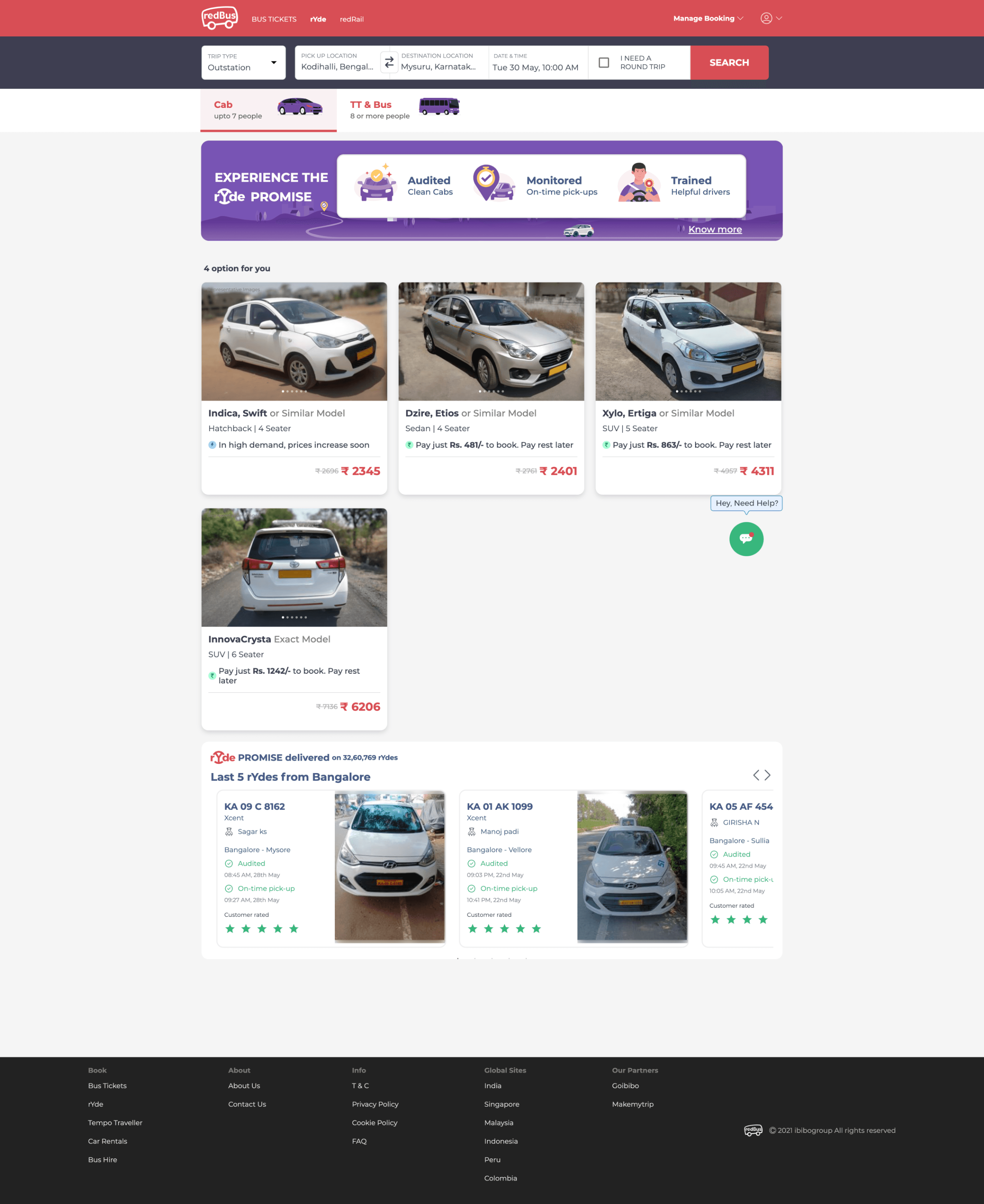
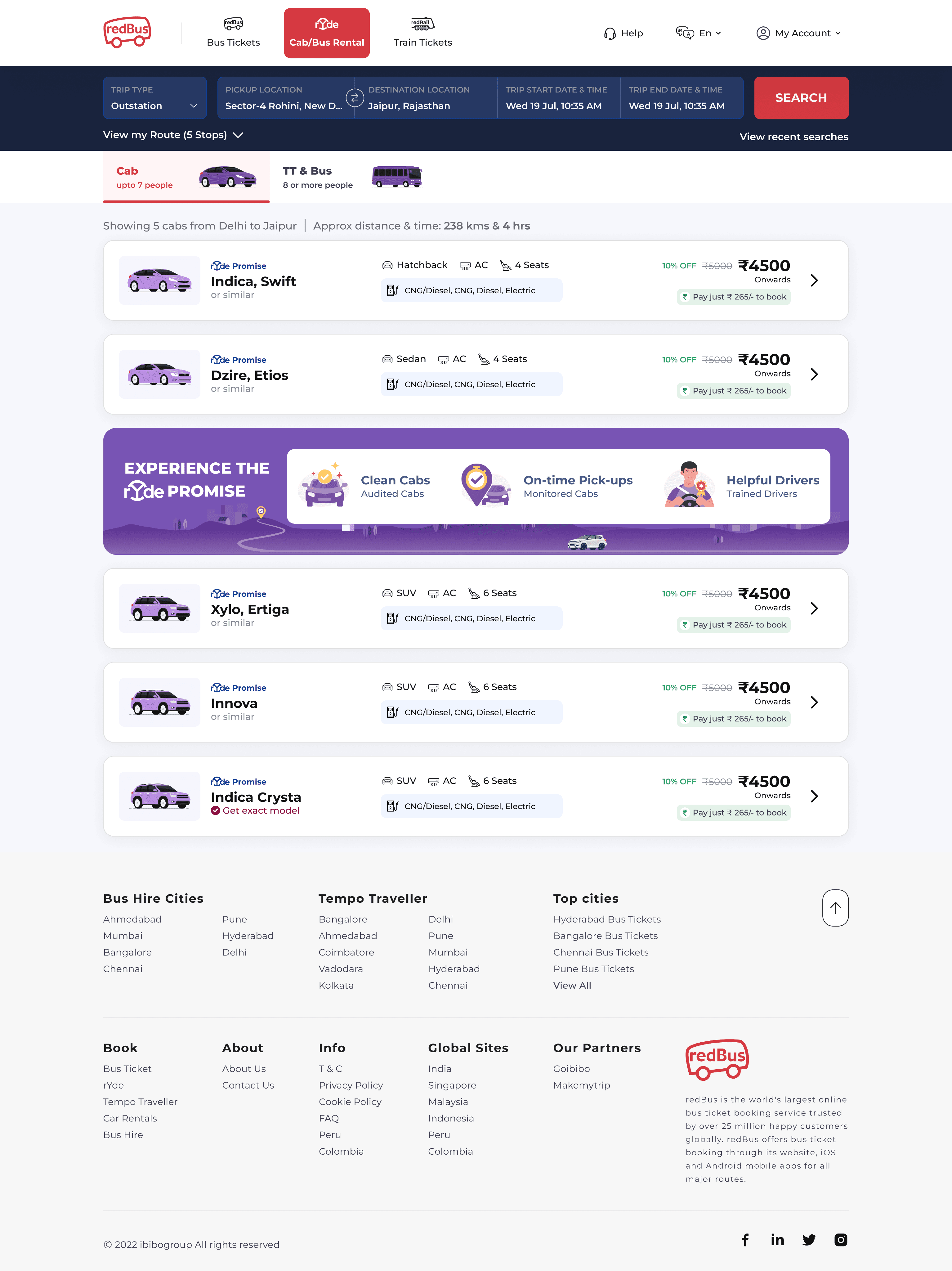
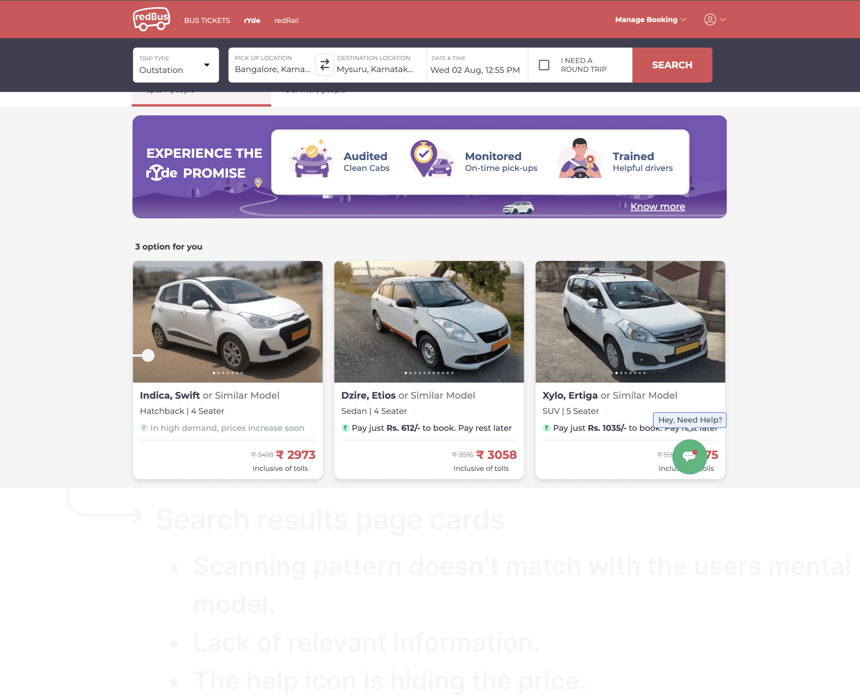
OLD
search results page cards
search results page cards
problem. in earlier design, it was difficult to scan and compare different cabs pricing because the scanning pattern doesn’t matches with the users mental model. also, it wasn’t consistent with our android and mobile web counterpart.
problem. in earlier design, it was difficult to scan and compare different cabs pricing because the scanning pattern doesn’t matches with the users mental model. also, it wasn’t consistent with our android and mobile web counterpart.
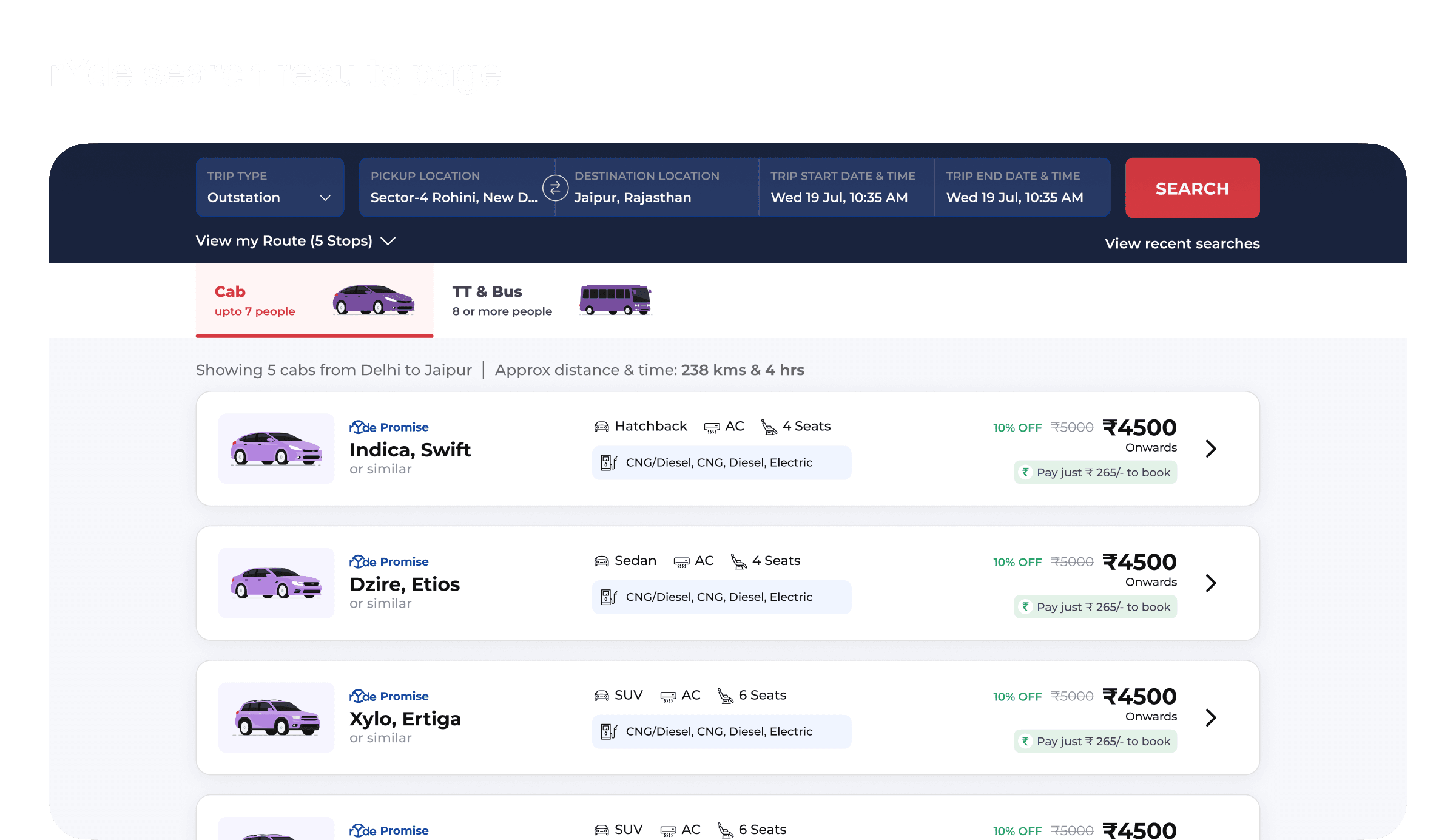
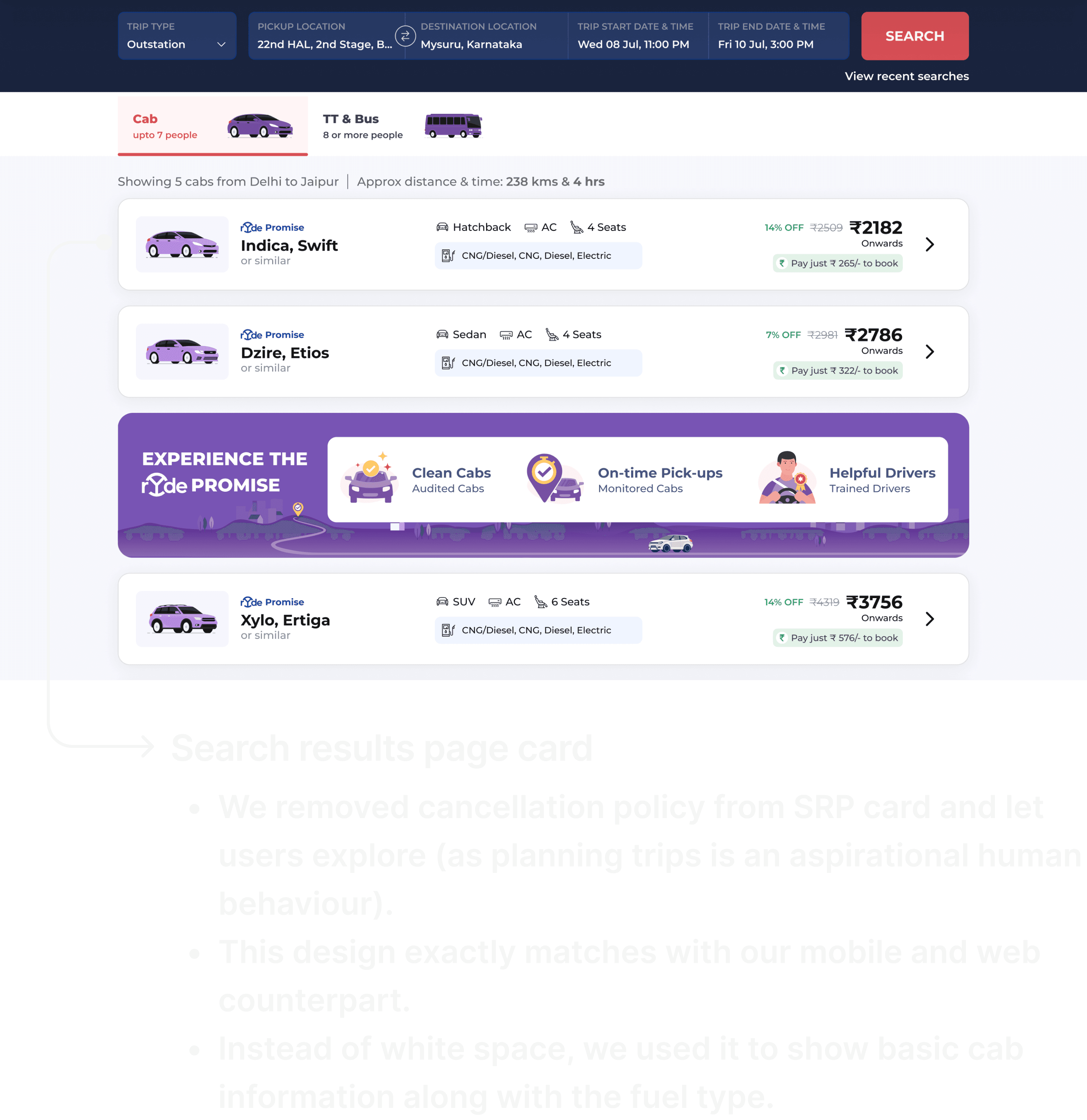
NEW
search results page cards
search results page cards
solution. after collecting the necessary data points and arranging them in a easy-to-scan layout, i came up with this design.
solution. after collecting the necessary data points and arranging them in a easy-to-scan layout, i came up with this design.
explore
explore
the iterations
the iterations
no, it was not as easy as it
seems and certainly i faced
no, it was not as easy as it
seems and certainly i faced
a few challenges
a few challenges
no design system
no design system
in place suited for web, i learnt a little bit about how to make scalable design systems.
in place suited for web, i learnt a little bit about how to make scalable design systems.
selective feedback
selective feedback
was a big challenge for me, not sure which feedback to take.
was a big challenge for me, not sure which feedback to take.
managing the needs
managing the needs
of both the user and the business was challenging.
of both the user and the business was challenging.
design process
design process
is not linear. it’s highly non-linear and highly collaborative.
is not linear. it’s highly non-linear and highly collaborative.
that's it for today!
i hope you liked it
that's it for today!
i hope you liked it
explore my other project
explore my other project
let’s work
together
reach out via

crafted with love in delhi, india
let’s work
together
reach out via
crafted with love in delhi, india